Dashboard — At-a-Glance Overview
The one-page fleet summary. Active alerts, connection pressure, slowest queries, top size consumers.
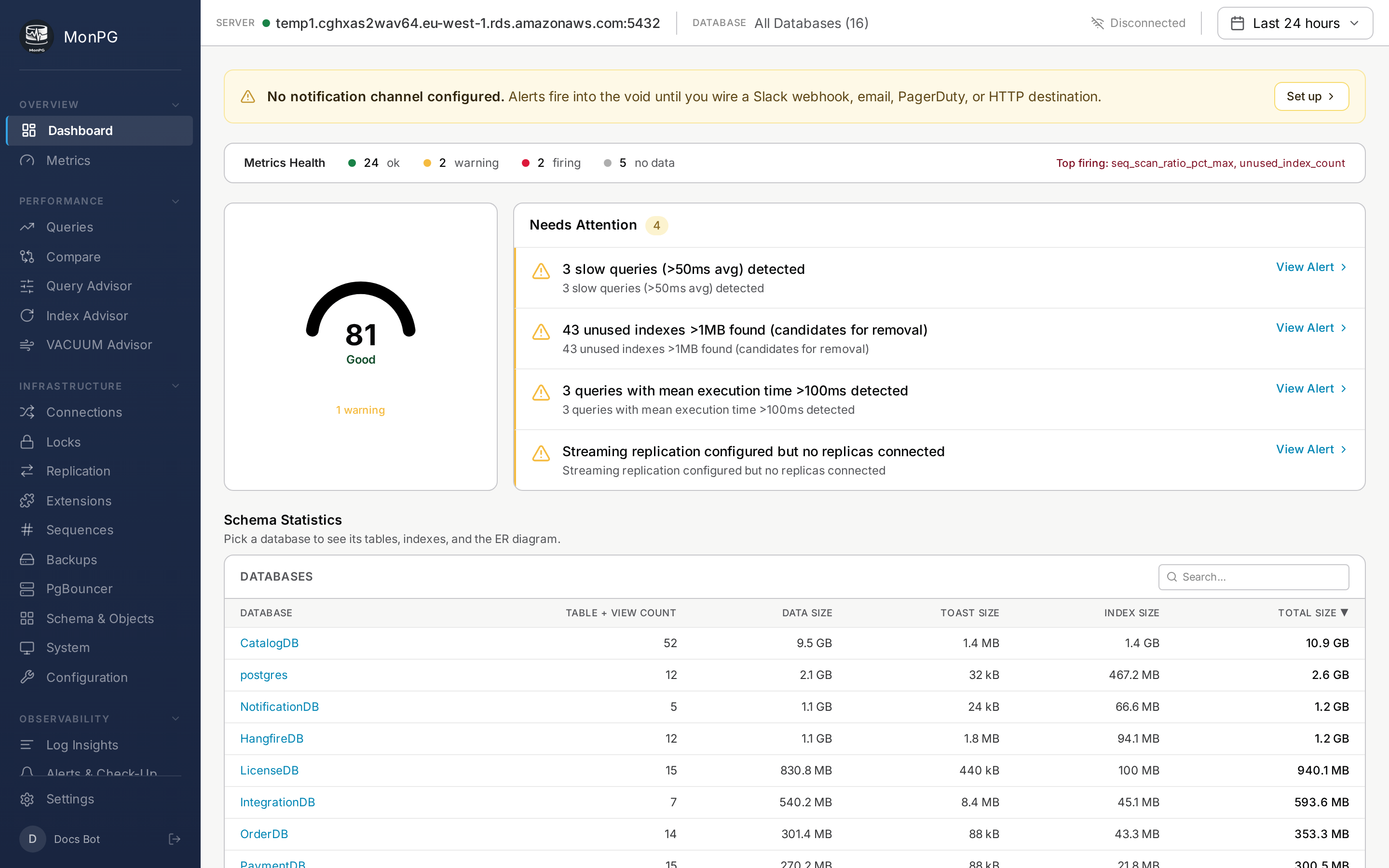
The Dashboard is built for the thirty seconds after coffee. It's not where you do deep analysis — it's where you confirm nothing's on fire and notice if something is. Six cards from top-left clockwise.
Alert summary
Counts of firing alerts by severity. Click a severity badge to filter the Alerts page to just that category. The "all clear" empty state is a feature; we work hard not to ship false positives, so a green dashboard means something.
Connection pressure
Current active backends versus max_connections across the fleet. If utilization sits over 90% for more than five minutes, your pool is undersized or a slow query is holding connections open. PgBouncer stats land here too if you have one in front of the cluster.
Slowest queries (last hour)
Top 5 by total_time, with calls and mean time and shared block reads next to them. Click any to jump to Query detail. The window is rolling — anything older than an hour goes to the Queries page, not here.
Log activity
Errors and warnings in the last hour, if log collection is set up. If the count is surprisingly low, check Settings → Servers → Logs — log collection might not actually be on. Zero is fine; near-zero often isn't, depending on your DB.
Top databases by size
Useful for capacity planning. Each row shows the total size and a 7-day growth trend. Click through for the per-table breakdown on Schema Statistics.
Fleet server list
Every monitored server with status (online / stale / offline), current TPS, cache hit ratio, and alert count. The server name navigates to that server's Queries page. The dropdown in the header gives you the same switch from any page.